Did someone say a new website?
So you might have noticed we have a new website (we may have mentioned it online a couple of thousand times). WELL, it was designed entirely in house by our incredible studio team, and one of the designers in said team has written us a guest blog to talk you through it. Get a tea and sit down for the whole lowdown.
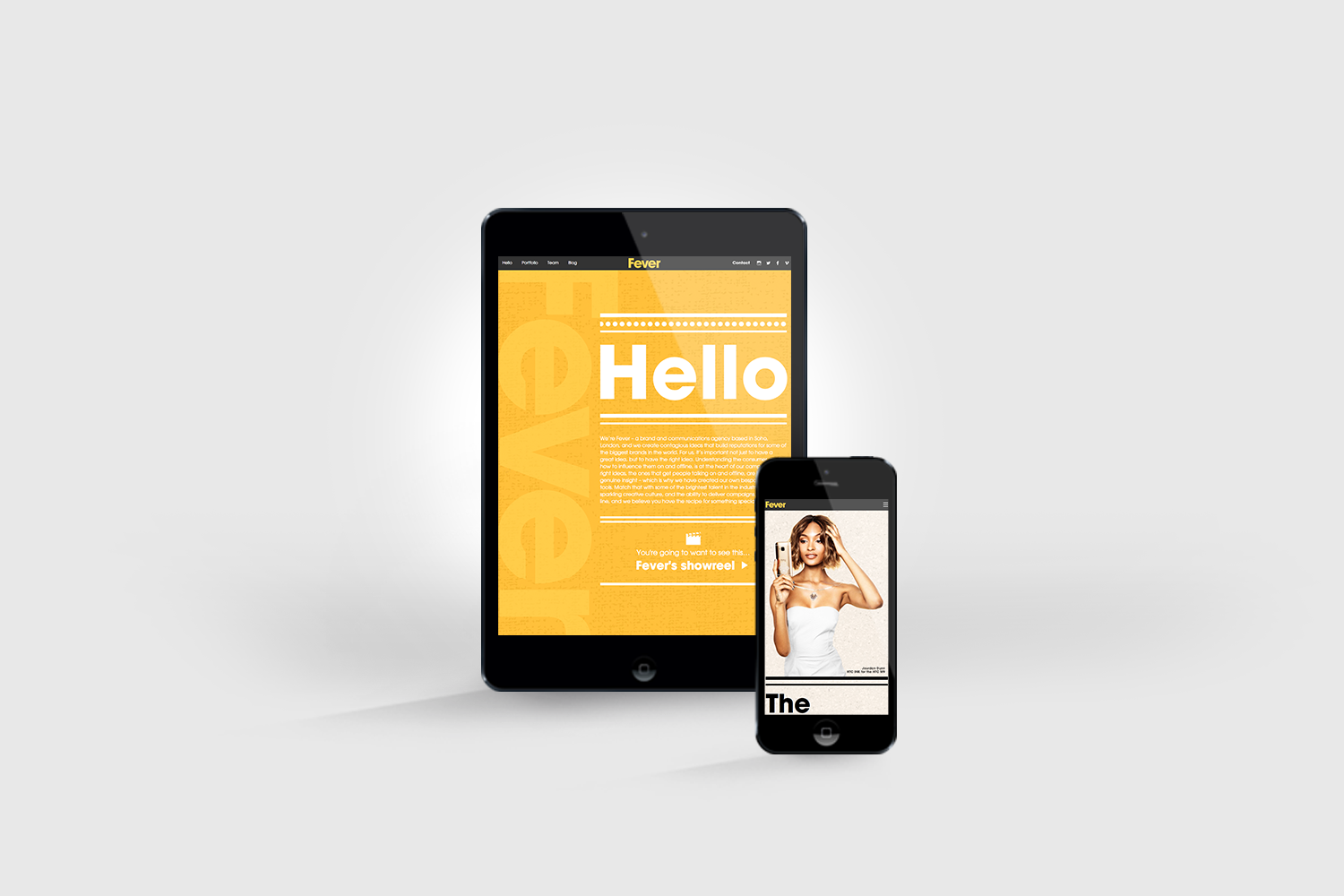
We have a shiny new website! Exciting, right?
As a designer for Fever, I felt as though I had a huge comms mountain to climb. So many brilliant campaigns, so much to shout about, how could I portray this visually? Although the work speaks for itself, a one-of-a-kind design was essential…
We needed a presence that was as strong, confident and as distinctive as us. It needed to be a take-over of the OXO tower kinda good.
Through analysis of web trends, a continuous scroll was a must; we all love our mobiles after all. We also opted for a full-bleed, motion-pan image on the landing page view; we wanted you to feel absorbed in what we do. To ensure you are able to navigate at all times, we designed a ‘sticky nav’ that is constantly visible wherever you are on the site. By selecting a section to navigate to, the website will scroll accordingly. To add some depth to each section you will also notice an additional texture to the background.
We felt as though it needed a Fever edge. Following design trends, tick! But making us stand out from the crowd…? Because we are unique in who we are and what we do, I portrayed this using bold typography, drawing on the catchy titles, and making these standout with a boutique-like aesthetic; distinctive lines and dots; what we are shouting about deserves to stand out in lights!
Inspiration was sought from a constant, never-ending habit of searching for the newest and best websites. It’s an obsession; one most digital designer’s are probably familiar with. I have become increasingly aware of what makes a good and bad website and what captures our attention.
An often forgotten factor within web design is the UI, the user interface, (which arguably could include the total “user experience;” the overall experience of a person using the website). The idea that you need to understand your user and their needs, extending further than the look of the website; where do they want to go next, how are they going to get there? They shouldn’t have to think about it? I refer to this as problem-solving design. Effectively solved, the usability, interaction and architecture are easy and desirable for the user.
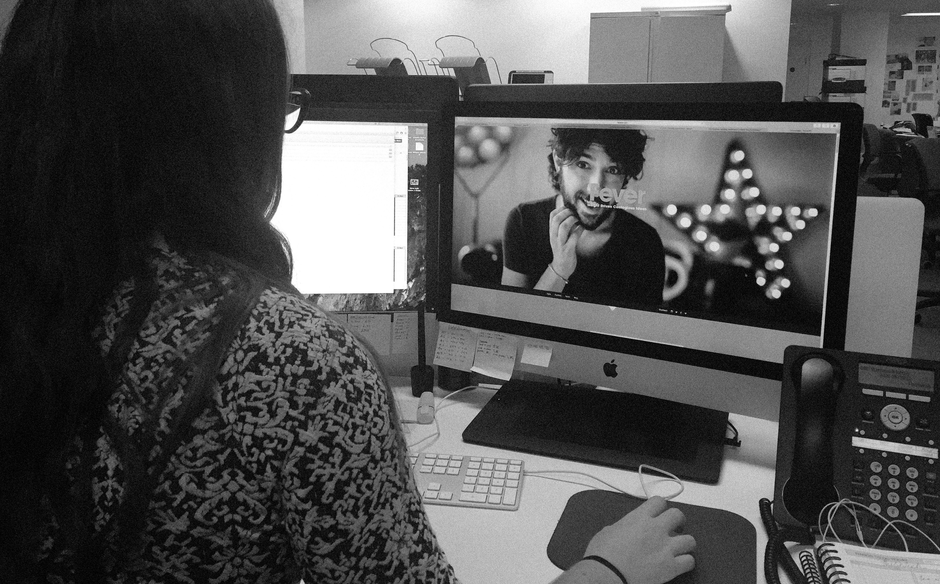
So here it is! Take a good look and watch this space for phase 2!